

BRAND POSITIONING
Innovative, reliable, and stylish provider of advanced and sustainable mobility solutions
PROBLEM STATEMENT
The website's sales conversion rate is low compared to Kia’s other digital sales services
OBJECTIVE
To find out the scope of improvements in the existing page while maintaining the existing user journey intact
PROCESS overview
Study
Kia’s user onboarding journey
vs.
its Competitors’ user onboarding journey
Analysis
-
Ascertain where KIA is at par with its competitors
-
Identify the scope of improvements
Upgrade
-
Preparing a Voice Chart
-
Upgrading Copies
-
Optimising the Form
-
Form validation
Audit
-
Existing Copy Review
-
Identifying scopes of copy upgrade
STUDY
Onboarding Journeys

Vs.
_edited.jpg)
_edited.jpg)
_edited.jpg)
ANALYSIS

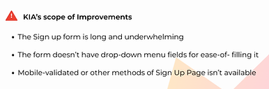
KIA's CURRENT
ONLINE BOOKING PAGE


AUDIT


UPGRADE
a voice chart to maintain copy consistency

Upgrading the Page Header and Sub-header
before


after

The Header reflects KIA’s brand personality
of being warm and inviting
The toggle switch at the top enables the existing users to be directed to another page for a quicker login
The subheader adds actionability and clarity to the new users regarding the purpose of the form
Optimising the Form for clarity & quick login
-
The sign up form has 11 information heads to be filled
-
No assistance
-
No assurance
-
Dry and functional
before

after
-
This version has 7 information heads to be filled
-
With assistance
-
With assurance
-
Warm, welcoming & less time consuming

before

Framing Form Validation Messages for all scenarios
-
Form validation message is present only for unfilled fields
-
No validation and assurance for filling the fields
-
The voice and tone are tactical and repetitive
after
-
Form validation messages across the website have been revised as per the chart above
-
This brings in Reassurance & Transparency
-
Tone and Brand Voice remain consistent
-
Enhanced Error Prevention

KIA's CURRENT
ONLINE BOOKING PAGE

KIA's UPGRADED
ONLINE BOOKING PAGE!

Scope for further improvement
-
Instead of two routes for booking, there should be one to reduce ambiguity
-
Mobile authenticated login will be convenient and easier for Users to get started. Google & Apple login options may be considered as well
-
Collecting most of the data for a new user in a step-by-step configuration process will not induce fatigue in the users
-
Indicating booking process milestones via UX copy and Design will further assist and assure the users
-
Accessibility needs to be added to the scope
end of case study